Reply With Quote
Man -some really really good stuff there!
Favorites right off the bat - Hartford! The Wild with North Star colors is fantastic. The Nordiques with the Avalanche colors is one of the best jerseys I've ever seen.


https://twitter.com/NHL/status/1328352418787168256
Thread starts here. More than half of these should be the full time jerseys.


Man -some really really good stuff there!
Favorites right off the bat - Hartford! The Wild with North Star colors is fantastic. The Nordiques with the Avalanche colors is one of the best jerseys I've ever seen.
12 team Yahoo Roto keeper (keep 3)
9 F, 6 D; roster 3 G max
G,A,PPP,SOG,BLKS,HITS - W,SO,SV%,Saves
F: B Tkachuk, Stutzle, Eriksson Ek, Necas, Konecny, Cooley, Boldy, Lehkonen, Tippett
D: Dahlin, Seider, Matheson, Durzi, Addison, Mintyukov
G: Hill, Husso
IR:
Bench: L Hughes, Merzlikins, Terry, Tuch
Maybe the biggest miss is the Canes using a Whalers logo instead of a Canes logo in Whalers colors.

Love the Whale. One of the best ever classic designs.
The purple Kings jersey also pretty sweet. Just couldn’t get on board with the yellow/gold jerseys with matching pants.
I actually like the Yotes look. Reminds me of NFL Ravens in the desert.
Nordiques jersey , simple yet very cool.
Awaiting Vancouver to bring back the spaghetti plate heading downhill. Still better than the Flying V.
Yahoo! 10 Team Keep 6, H2H - 1 win
G, A, SOG, PPP, FOW, H, B, Wins, GAA, Sv%, SHO
2C, 2RW, 2LW, 1Ut, 4D, 3G, 6Bench, 2-I/R+, 1NA
C: Bennett, Strome, Haula
LW: Draisaitl-C, Stutzle-C, Kaprizov, E.Kane
RW: Marner I/R,T.Thompson-C, Necas-C, Svechnikov-RW/LW, Hathaway
D: Dahlin, Bouchard, Gudas, Benoit, Schneider, Burroughs
G: Vasilevskiy , Skinner, Gustavsson
4 weekly minimum starts required
I/R: Sergachev
When I say nothing, I say everything. J.White


Yeah... some of these are gorgeous - some are hideous.
But overall - a few absolute gems.
https://www.flickr.com/photos/655167...57716910961806 (good link)
https://www.nhl.com/news/nhl-reveals...ys/c-319633384
My grades:
ANA: C. Colours are good, but the duck 'cmon.
ARI: C-. Purple can be done (see Kings, LA)... but it needs some accents on the shoulders.
BOS: B+. Actually a nice jersey, especially in close-up shots.
BUF: D. Too busy, crossed-swords is too dull, IMO.
CGY: C. I don't like the gentle diagonals at past-elbow & hem
CAR: B. Agree... if they went Canes logo, would've been sweeter. I remember when the Whalers issued the grey... didn't like it then, didn't like it now.
CHI: A. I mean, Blackhawks do nice jerseys.
COL: A++. I mean if we can't all agree this is the GEM of the jerseys... get the eff out of this thread.
CBJ: C. Bottom striping is too wide. Looks like a 7-year olds night shirt. Colors are nice.
DAL: B-. Solid, no mistakes, but also nothing that makes me say "Wow".
DET: D. Fuggin practice jersey.
EDM: B. Actually one of my favourite jerseys but the orange is too creamsicle for all that white.
FLA: A-. Great color scheme and a great logo. The sleeves kept it from A territory.
LA: A. Love this jersey, my 2nd fave. Numbers on the sleeve-band are a nice look for a retro-feel.
MIN: A. Love these, maybe my 4th fave - right there with NJ. Just a beautiful jersey.
MON: A-. They had to go blue to be different from others... so there wasn't that much wow - I like it, there's just no wow upside available.
NAS: B. Solid jersey. Sleeves & numbers aren't my faves.
NJD: A. This is my 3rd fave, behind COL & LA. Goregeous. A+ if the logo was higher on the chest: WTF.
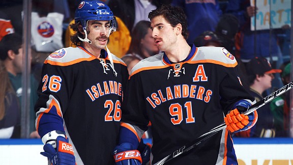
NYI: A. Love that deep blue.
NYR: C. Rags fans probably have good memories of these... but those numerals and lack of hem/shoulder accents is blah, for me.
OTT: B. Solid jersey... and they had to keep from infringing on Hawk-style. Numbers too big for armband though.
PHI: D. Ugh, those shoulders/sleeves wreck the whole jersey. Damn it.
PIT: C+. Simple, but solid. I don't love these or hate these. PIT is one of those teams that just really doesn't need to try to push another jersey.
SJ: C-. I know grey is probably a fun throwback color, but it doesn't work here - looks like PJs.
STL: D-. Gross. Sorry Wayne fans... I'm not sure who picked that for the retro-throwback, but earlier years (late 60s, or 70s) would've been better base.
TB: B. That Tampa Bay text was always goofy, but it's a nice jersey.
TOR: B+. I've read some that don't like these... but I think they are solid with the full shoulder/sleeve run. I dig it.
VAN: F. Wow, just wow. Barf. WTF.
VGK: B. Colours are great! So great that even though I hate the logo, and diagonals, I give it a B. (worser choice of colours... C-grade)
WAS: B. I like it, especially since it was the Ovechkin-rookie logo... back when they had that awful, awful color pallet. Old logo with the rocking bright US colors.
WPG: A-. Not many teams can pull off the grey, but this works.
Mostly awesome. The Blues with that red is awful horrible.


I love some and really don't love others. Dislike Leafs Blues Vegas and Washington
"Did we just become best friends?"Originally Posted by Pengwin7

"Yep"
"Wanna go do karate in the garage?
12 team Yahoo Roto keeper (keep 3)
9 F, 6 D; roster 3 G max
G,A,PPP,SOG,BLKS,HITS - W,SO,SV%,Saves
F: B Tkachuk, Stutzle, Eriksson Ek, Necas, Konecny, Cooley, Boldy, Lehkonen, Tippett
D: Dahlin, Seider, Matheson, Durzi, Addison, Mintyukov
G: Hill, Husso
IR:
Bench: L Hughes, Merzlikins, Terry, Tuch

General feedback:
1/3 really good
1/3 meh
1/3 not so great
In other words, just like most third jersey unveils
Contact me for Frozen Tools bug reports and inquiries
Follow Frozen Tools on Twitter @FrozenTools
Follow me on Twitter @DH_EricDaoust


My only complaint about the Avs jersey is they keep freaking winking at the Nordiques instead of going full into it. That has bugged me so much.
My honest favourites are the Ducks (because they're bad), Arizona, Buffalo, Kings, Blues, Florida, NJD, Carolina, SJS.
I am very much a fan of ugly jerseys though. Like they need to be god awful for me to like them.
12 Team, H2H, Keep 6 (in Bold)
G, A, Pts, PPP, FW, SOG, Hits, Blocks
W, Saves, S%, GAA, Game Started
2C, 2LW, 2RW, 4D, 1Util, 2G, 5BN, 2IR, 1IR+, 1NA
C: Horvat, Trocheck
LW: J. Robertson, Byfield (C), Guenther
RW: Pavelski (C), Giroux (C), Svechnikov (LW)
D: Fox, Makar, Bouchard, Morrissey, Gudas
Util: Meier (LW, RW)
G: Oettinger, Georgiev, Samsonov, Woll
These I disagree with
ANA/ARI: It's fun. Jerseys are supposed to be fun
CGY: Blasty is the best thing to ever happen to the franchise
CHI: It's fine. A solid B-. Not an A
NYI: It's the same jersey they're already wearing.
NYR: Logo is great
VAN: Jersey is great. Fade is awesome. These are an A.
These we're in lock step on.

minnesota is the only one that blew me away . nice job using the old northstars colors .
also like oilers/jet/pens/devils
man , did the islanders even get out of bed to attend this event ? They could have at least did something simple like the Habs
I'm not a fan of avs and canes using nords/whalers stuff .
I think the Isles were like "Listen... we're not playing... we know you are trying to set us up for more jersey failure... and. WE. ARE. NOT. PLAYING".
#UseAdarkerBlue.DontContactUsAgain
EDIT: For any of you with an ESPN+ subscription, Wysh did his own rankings - which had COL at #1... VAN at #31. It's a pretty good list... though I strongly disagree with NYR at #2 and ARI at #3.
https://www.espn.com/nhl/insider/sto...2020-21-season

Interesting how the collage pic from the NHL has the Hawks as the only team showing the back of their jersey. A lot of chatter today about them hiding the front of their jersey.
10 Team, 60 Player Roster
G, A, PTS, PPP, PIM, BLKs, Hits, +/-, Shots, W, GAA, SV%, Saves
C- JHughes, Trocheck, RThomas, Zegras, Norris, Bennett, PLD, Stephenson, Danualt
RW- Raymond, Stone, TWilson, Toffoli, KJohnson, Nyqvist, Zary
LW- Keller, Schmaltz, Bunting, Skinner, Barbashev, Duclair
D- QHughes, McAvoy, Doughty, Heiskanen, LHughes, Mintyukov
G- Shesterkin, Demko, Andersen, Kahkonen, Levi, Tarasov, Annunen
Notable Prospects- Nikishin, Kulich, Leonard, Wood, Perreault, Lekkermaki, Ostlund, Othmman, REvans, L-Heureux, Ivanov, Murashov
P7 . A lot of the younger islanders fans absolutely love the fisherman logo and are crushed that it wasnt utilized in this retro event
 Posting Permissions